Bringing back the finesse to digital product design

I LOVE Typography. I studied it at LCP. It’s arguably one of the most underrated aspects of modern digital product design, and IMHO the most taken for granted. It’s one of the elements of a digital experience that most human beings passively enjoy, yet don’t really know why.
To understand typography, I humbly proffer a foundation starting with the history of how type was originally used in all visual communication. How type is arranged into words, and compiled into art.
I personally think it’s important for any designer to learn about the history of typesetting. (BTW I don’t think this is gatekeeping, typography is as important as every other visual element in design).
Typesetting is the most practical application of typography. Everything you interact with which displays a language is typeset.
There are four main parts to the story of typesetting, ‘Manual’, ‘Hot Metal’, ‘Photo’ and ‘Digital’. I shall attempt to summarise them here:
Part one: manual typesetting
Manual typesetting is arranging a bunch of letters into words and spaces, multiple times to create a sentence. This arrangement can be used to create an impression, or ‘print’. Thats basically the kernel of any piece of written communication.
For brevity and cultural relevance I’m not going to go back to China 1040 AD (the invention of moveable type), but rather to the good old days of letterpress.
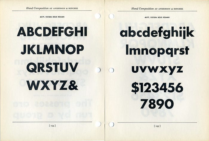
Letterpress printing was developed by Johannes Gutenberg, in about 1440, of modern ‘movable type’ printing from individually cast, reusable letters set together in a “forme” (frame or chase).
Metal ‘movable-type’ was a bespoke assembly of alphanumeric characters more commonly made out of lead-antimony-tin alloy, assembled in lines, ready to be coated in ink and pressed onto paper.

The characters were kept in a large wooden case. The upper part housed the capital letters, and the lower part contained the regular letters.

This is where the terms ‘UPPER CASE’ and ‘lower case’ originate!

You like that one? well here’s another: the spacing between the lines was created and managed using thin strips of lead. Thats where the term ‘leading’ (rhymes with ‘bedding’) comes from.

Your design software will call it ‘line spacing’, but the etymology of typographical terminology is a fascinating look into the past.
See? I told you this would be fun!
Part two: Hot metal typesetting
Oh boy, are you in for a treat…
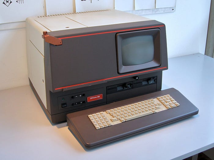
Linotype machine
Imagine a huge machine, with a 90-character keyboard on which you could type sentences, and in real time the machine would punch those letters into a strip of hot lead, making a line of type (hence a line-o’-type).

Compositors could then assemble entire sentences rather than individual letters. The Linotype machine, invented by Ottmar Mergenthaler in 1884, totally revolutionised typesetting and newspaper publishing. It’s absolutely bonkers. Thomas Edison called it ‘The Eighth Wonder of the World’.
In 2012, Douglas Wilson made a wonderful film about the Linotype machine, Linotype: The Film:

It’s a fascinating look in to a mechanical marvel and one of the biggest heroes of the industrial revolution.
You can watch it on Amazon Prime
RIP Linotype Machine. From the late 19th century to the 70’s, the king of composition. But as with all mechanical technologies, it would be superseded by a much cleaner, quieter, smaller and simpler process…
Part three: Phototypesetting
Phototypesetting was invented in 1949, using a photographic process which projected light through a negative, then developed onto light sensitive film. but it wasn’t until the 60’s that the technology took off, using CRT screens, rather than projectors, to project light. As the technology got smaller, cheaper and more sophisticated, it became the new gold standard in typesetting. No more huge machines, hot lead, noise and mechanical issues.
Due to the small size of the CRT, the technology was good for magazines, but not not big enough for newspapers. By switching from film to photosensitive paper, the whole thing could be moved around easier, so then became a perfect fit for the newspaper industry who were desperate to migrate away from hot metal typesetting. By the mid-1970s, almost all of the newspaper industry had switched to phototypesetting.
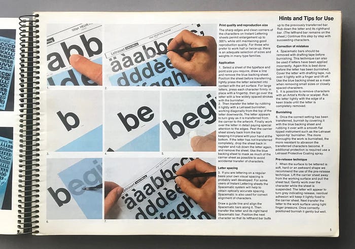
Honorable mention: Letraset
Letraset was a ‘dry transfer’ lettering system which was introduced in 1961, a sheet of letters, of a particular typeface and font that you ‘burnished’ (rubbed onto) your artwork using a stylus, pen or whatever you liked.
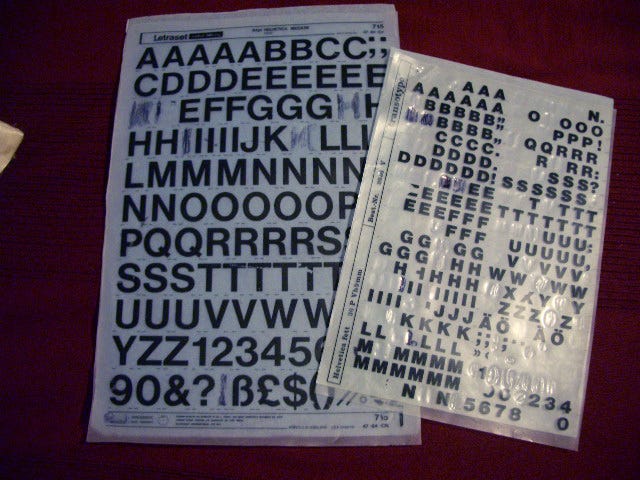
It was such a hugely successful, simple, cheap and accessible DIY method of typesetting. Used extensively during the 1960s, 1970s and 1980s, it was a a huge favourite with graphic designers, architects and artists, a ‘home brew’ Phototypesetting technique, and the easiest way to visualise an artistic typographic flair not constrained by the sluggish advance of technology.

But as with everything, technology progressed to ‘render’ Letraset, along with ALL types of Phototypesetting, entirely redundant.
Part four: Digital typesetting
As computers and digital technology became ubiquitous in the early 80’s, typesetting, along with most mechanical or analogue industries, had to upgrade.
And my goodness it did. Everything shifted to computers. From the input to the output, everything went digital.
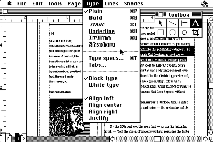
New software was created, not just to set type but to build entire page layouts. Desktop Publishing (DTP) was born. A small company named Aldus was about to change the game…
Aldus ‘PageMaker’ was introduced in 1985 for the Apple Macintosh. Along with the mouse-driven, graphical interface of the Mac OS, it birthed creative digital document design.
I first experienced digital document design on the Apple Mac SE/30 at art college. It was marvellous. You could create whole documents visually and the typographic controls were first class. I loved that software and that computer.
I am lucky enough to have one of those computers at my home. It’s my favourite Mac of all time, and still runs Photoshop 1.0.
And so to the present day, we use computers to set type, via a desktop publishing application, or one of the copious design apps that can create a digital experience.
And thats your foundation of how type came to be on your computer. However, as with most technological advances, some of the ‘craft’ and the ‘finesse’ got left behind. And thats perfectly fine. But that meant people did not ‘need’ to understand type design, as most of it was already at the fingertips. It’s so easy to knock out a bunch of text on an artboard now. Technology has afforded the democratisation of design, but typography is an art.
What happened to typography?
Short answer:
It got lowballed due to the advent of ‘digital product’.
Long answer:
The issue with digital design is that it is mostly rebuilt using code, either web standards (HTML/CSS/JS etc) or native app (Objective C, Java, React etc) and that code does not fully respect typographical conventions. Web and app users consume information differently. Consequently it got deprioritised. It’s THAT simple
Also the ‘anyone can design’ mantra espoused on LinkedIn, meant that everyone can make stuff, yet have no formal training on the rules of typography.
But fuck that I’m repping typography. It's BRILLIANT.
Why is typography so important?
Well first of all, the rules of typography are the rules of comprehension. Take the simple rule of size:
Size
Size is often equated with importance, well this is the first principle of typography:

Typeface v font
Helvetica is not a font. It’s a typeface. Helvetica Bold is a font. A typeface is a family of fonts. A font is a specific version of a typeface.
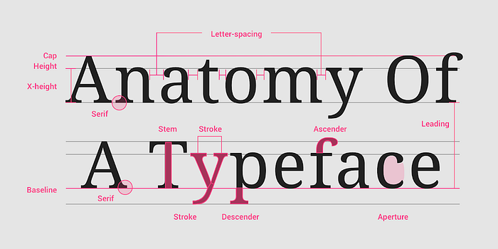
Anatomy
Every single part of a piece of type has a term, while its not critical to know these nowadays, its a lovely thing for designers to learn
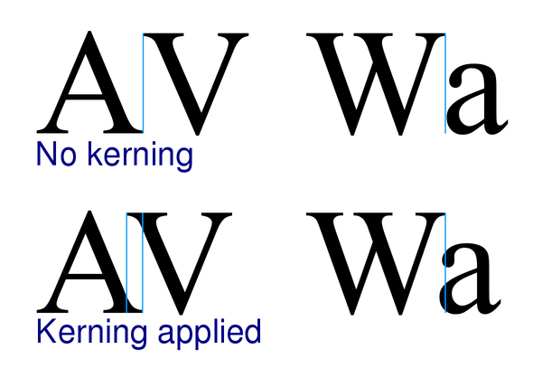
Kerning
Not to be confused with tracking, or line spacing, Kerning is the space between two individual letterforms.
Why is it not all a uniform spacing across the typeface?
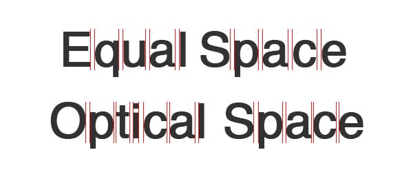
The issue with digital type is that type is inherently optical. Different font characters are spaced together differently. these are called ‘kerning pairs’.
Most letter characters don’t have straight optical edges, which creates an optical illusion, to compensate for this the spacing between those letters needs to be adjusted to be visually commensurate otherwise the spacing looks off.
Swiss Style
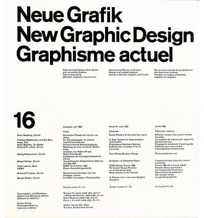
International Typographic Style, or ‘Swiss Style’ was a movement that started in the 1920’s, that was hugely influential to interface design, it also truly elevated typography to an art form.
Swiss Style followed a mantra of ‘form follows function’. It used a grid, sans serif typefaces, it respected content, and became the blueprint for most modern graphic design techniques, along with helping to make interfaces and systems more user friendly.
Legends of type design
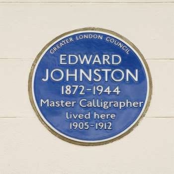
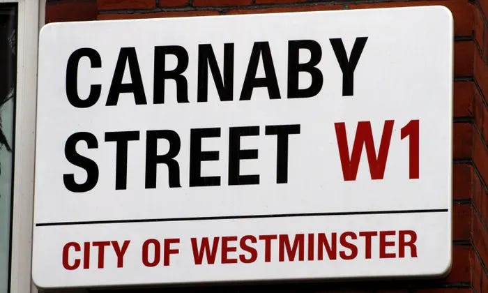
Edward Johnston
Widely considered as the father of modern calligraphy, Edward Johnston CBE (11 February 1872–26 November 1944) was trained in medicine, yet taught himself the art of lettering, and began to teach others. He taught at the Central School of Fine Arts and Crafts, London, and subsequently at the Royal College of Art.
His most famous work is the typeface and logo for the London Underground, which bears his name. Johnston, commissioned in 1913 by Frank Pick, commercial manager of the Underground Electric Railways Company of London, who specified to Johnston that he wanted a typeface that would ensure that the Underground Group’s posters would not be mistaken for advertisements and should have “the bold simplicity of the authentic lettering of the finest periods” and belong “unmistakably to the twentieth century” Pick considered a sans-serif best suited to transport use.
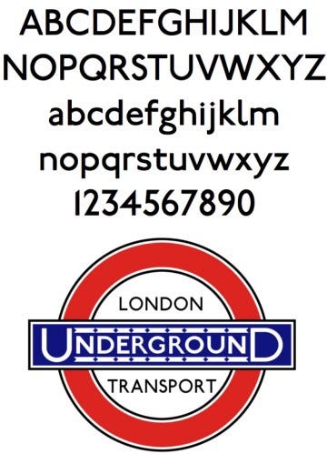
This legendary brief and relationship between client and designer resulted in the most widely recognised typeface in history.
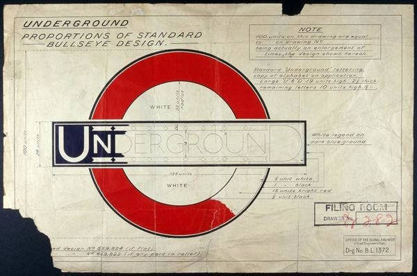
Johnston was the first time a typeface was commissioned for a transport system.
Johnston got redesigned in the 80’s, mainly due to the advent of digital applications, but still remains the best example of a typeface created absolutely for a purpose, and will forever be one of the most recognisable uses of type design in history.

Paul Renner
Paul Renner (9 August 1878–25 April 1956) was a German typeface designer. He is best known for designing the Futura typeface in 1927. Futura is arguable one of most successful typefaces of the 20th century, a geometric sans serif powerhouse, with a huge whiff of Bauhaus.
Futura was designed as a contribution on the New Frankfurt-project. New Frankfurt was an affordable public housing program in Frankfurt started in 1925 and completed in 1930. It was also the name of the accompanying magazine that was published from 1926 to 1931 dedicated to international tendencies in architecture, the renewal of art, housing and education.
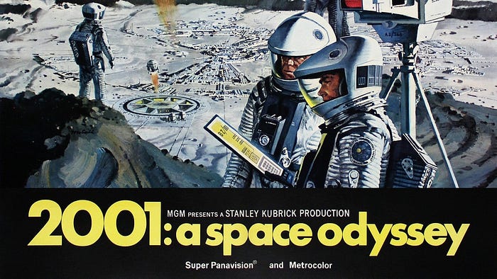
Futura was used in science fiction movies, most notably 2001: A Space Odyssey
You can see Futura still used heavily in the 21st Century EVERYWHERE:

Herb Lubalin
Herbert F Lubalin (March 17, 1918 — May 24, 1981) was an American graphic designer. He designed the logo for Avant Garde magazine (1968–1971). It's brilliant.
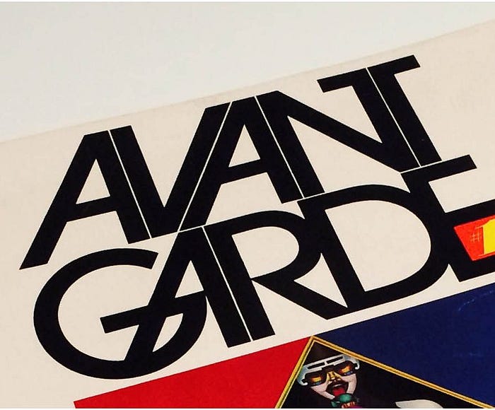
Its also great example of how a logo design can be turned into a full typeface. In this case, ‘ITC Avant Garde’, designed by Herb, along with colleague Tom Carnase.
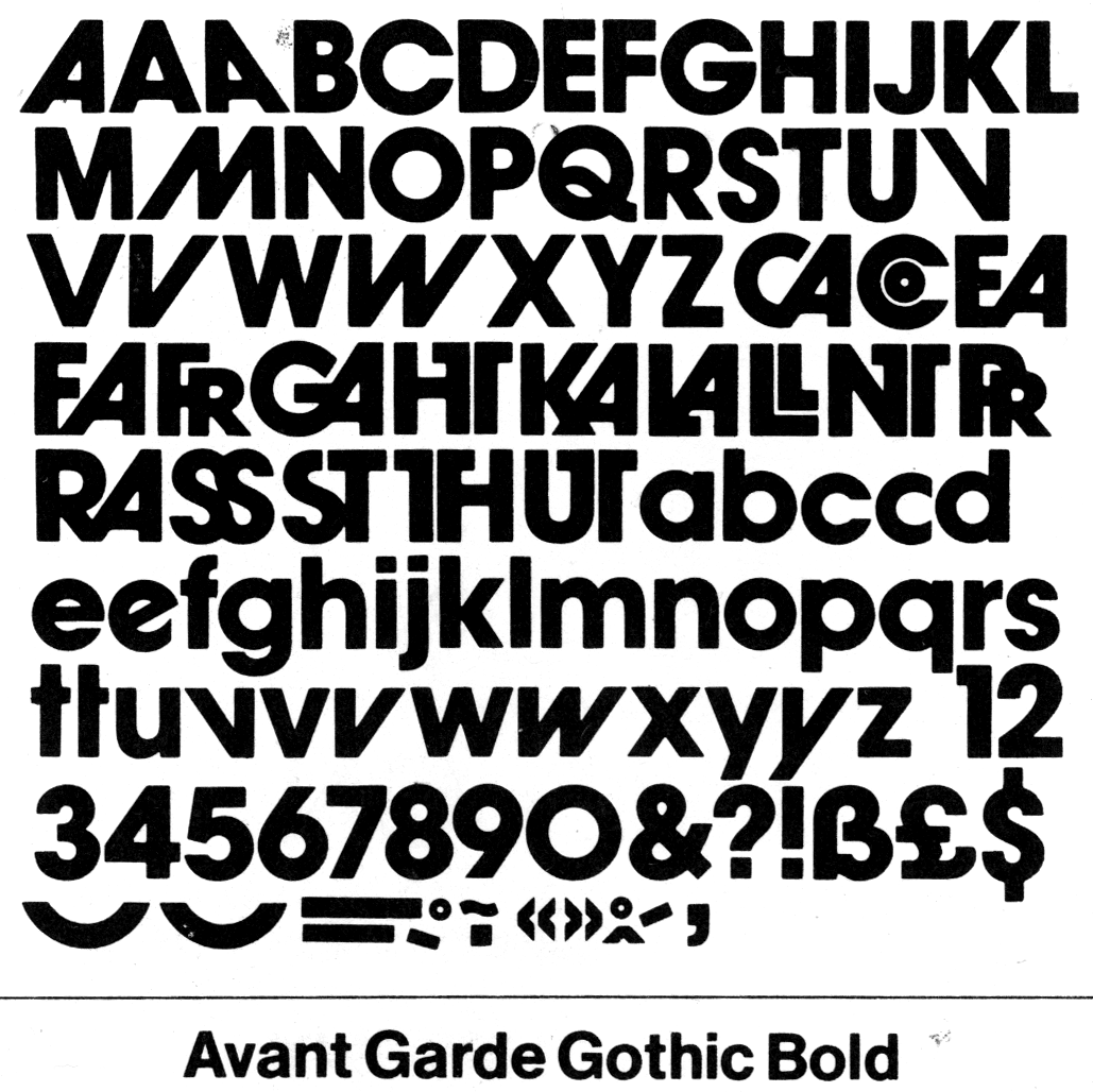
It's a hugely popular typeface. You may recognise the lower case letters in the adidas logo:

Or its use in the Stranger Things title sequence credits:
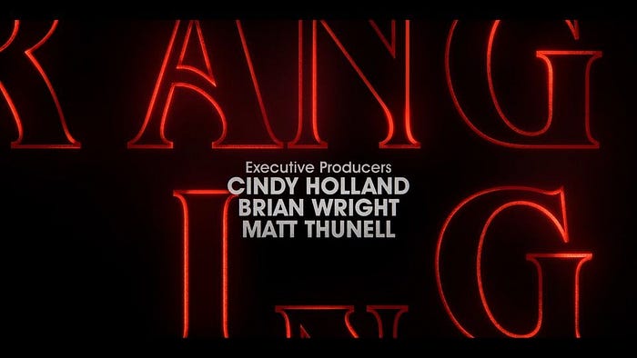
It’s often used as a retro sub-styling, but its uses span so far and wide.
Adrian Frutiger
Swiss typeface designer Adrian Frutiger (24 May 1928 — 10 September 2015) created three of the most popular san serif typefaces of the modern era: Univers, Frutiger and Avenir.
Univers was designed in 1957, a Neo-grotesque sans serif in the German style. Used extensively in maps and signage, and for the instructional diagrams and user interfaces for everything from Sony to Audi dashboard graphics.
Univers was also the typeface chosen by Otl Aicher for his groundbreaking work on the 1972 Munich Olympics
Avenir, French for ‘Future’ obviously influenced by Futura, was super accessible, and a more modern alternative to Helvetica. More recently the Avenir Next typeface has been used by the BBC, replacing their previous use of Gill Sans.

It’s also the Typeface used throughout the Disney+ streaming service

10 typographic tips
- ‘When You Highlight Everything, You Highlight Nothing’ — try to practice judicious use of bold or capitals letters to highlight text or emphasise a word, as overuse can negate everything.
- People cant read capital letters as easy or quickly as lower case. Learn how and when to use them. Headings, yes, emphasis, judiciously, whole sentences, no
- Don’t use too many typefaces. Start with two, the brand, or house style , and the secondary typeface for the main body of the text. A third could possibly be used but as a mild flourish or as part of an illustration. Don’t use more than three.
- Establish a hierarchy. Heading, Subhead, Body etc, look at font choices and create harmony and proportion
- Learn how and why to align text elements to create visual balance
- Learn spacing. Space maintains the flow of design, and it gives strength to structure. Leave sufficient space between typographic elements, and don’t use too much or too little spacing between letters. Same with leading. It all needs to look balanced and be easy to read.
- Make sure there is enough contrast between the text and its background
- If in doubt, LEFT ALIGN text. Its the easiest to scan
- Test your typography on the smallest screen possible, then work upwards. If it works on mobile first then you aren’t going to have issues
- Form follows function. The primary goal of any text is to be read.
Well I hope you’ve enjoyed this potted history, and next time you venture into designing digital productsfor humans, consider giving a little more love to typography. It’s amazing.
Thanks for reading x